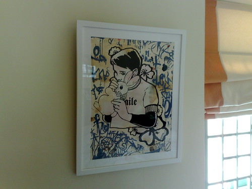
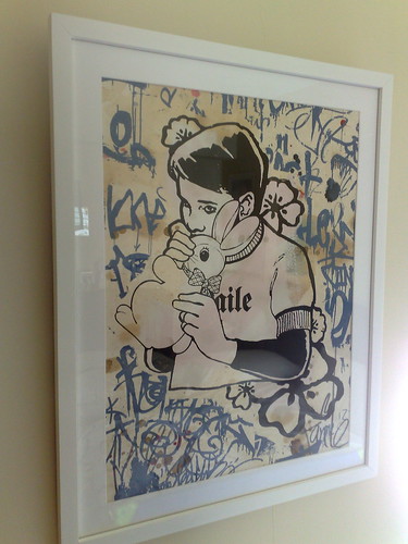

After so bloody long did I bother to bring my arse out of my computer chair (damn you Facebook!) and send my Faile's Bunny Boy Blue print to the framer. (Don't ask me what is the official name of the print, it was sold as Bunny Boy Blue by Black Rat Press)
Anyway, there are a couple of reasons why I did not send the print to the framer once I got the print. Firstly, I was framing my BAST prints as priority (My Cash Bazaar and Und Erotik). But most importantly, I have no idea what is the best way to frame it (I always love metallic coloured frames but it doesn't look good with this print).
So I lurked at Faile forum to check out some of the framed Failes that the members posted and I saw that most of them go for white frame with white matt. (The other option is acrylic box but it is expensive!) And white on white actually shows off the Faile-iness (wat?) of the artwork in the best way.
Though, I was really tempted to go for a glitterly gold antique looking frame for this piece but changed my mind at the framer when my framer asked me whether I am colourblind or simply blind.
Anyway I went for white on white, and I truly love the final framed piece. I have hung it in my bedroom and now I wake up every morning to see this beauty. This has inspired me to frame the rest of my Faile prints still lying in tubes or in my folder. (yeah right... another few months perhaps before I lifted my arse off the computer chair thanks to Warhammer Online now...)
(If only I know how to explain to my wife why the boy is kissing the rabbit and what is the hidden meaning behind the artwork... Anyone?)


